by Abhinav Dua

Google has taken the wraps off the new version of Android called Android “L”. With its release, Google has put more emphasis on providing a buttery smooth UI experience which they call Material Design. According to the company, it is the biggest update made to Android till date. So without further ado, let dive in and take a detailed look at what’s new.
MATERIAL DESIGN
Material design essentially brings a new design paradigm to Android. It is meant to provide a more consistent and universal look across different devices like tablets, desktops and smartphones.
Changes to the design include an updated version of the default font Roboto, bold, dramatic colors and simple yet elegant animations which make the overall experience terrific.
“We imagined.. what if pixels didn’t have just color, but also depth? What if there was a material that could change its texture? This lead us to something we call material design,” said Matias Duarte, Director of Android User Experience at the Google I/O conference.
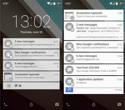
REDESIGNED NOTIFICATIONS

Gone are the boring old notifications, enter new stylish and interactive ones. You now get notifications on the lock screen as well. Want to open the app? No worries, just double tap and BAM the app is up and running. All the notifications now appear in a card based format, which in our opinion looks much better.
Also, Google has chucked out the traditional pull down notification panel. Simply swipe down from the top, and you get to see your notifications with a translucent home screen.
One big change here the ability to take or receive calls while playing your favorite game or browsing the web as shown below. You get a notification in a similar way as the banner notifications on iOS.
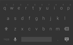
KEYBOARD
Google has updated the stock keyboard, which now appears much like the one found on the Lumia devices these days. The keyboard adorns a slate-grey theme along with borderless keys. However, it is yet to be seen whether Google’s new keyboard can match the text-prediction capabilities of other third party apps like SwiftKey.
Google has updated the stock keyboard, which now appears much like the one found on the Lumia devices these days. The keyboard adorns a slate-grey theme along with borderless keys. However, it is yet to be seen whether Google’s new keyboard can match the text-prediction capabilities of other third party apps like SwiftKey.
ART IN, DALVIK OUT
For those of you into the nitty gritty of Android, this might make more sense. Remember the ability to change from DALVIK to ART runtimes on your KitKat device? Well, now Google has gone a step further and completely obliterated DALVIK.
The company claims that the new default ART runtime should have significant impact on app startup times along with considerable gains in battery life.
WRAP-UP
Finally after adding tons and tons of functionality each year and not paying heed to the UI, Google has decided to step up their game and compete directly with Apple. Apple devices are considered to be the benchmark in terms of design and overall consistency offered across the different iOS devices.
Unlike previous years, Google has decided not to begin the rollout immediately. Instead, they have released preview system images for testing purposes. Those with Nexus 5 and Nexus 7 devices are in luck as these are the only devices for which the images have been released as of now. The official “L” update will be available sometime this fall.
Let us know your views about the latest release in the comments below.
 RSS Feed